Engineering at MindLink
Visualising Skype for Business Persistent chat data
August 09, 2018
Persistent Chat allows the Skype For Business users to create topic-based discussion rooms that persist over time. This feature allows users within an organization to discuss either casual or business related subjects in chatrooms dedicated for a desired purpose. Logically, a lot of business relevant data for an organization is generated in those chatrooms so it would be great if we could extract that information and visualise it in some modern and cool charts, wouldn’t it?
Proof of concept
In this post we are going to show how easy it is to use Power Bi tool and to visualise some interesting statistics about the Persistent Chat usage in one of our dev environments. The goal with this exercise is to be able to display the 5 top users for any desired chatroom in a classic bar chart.
Enter Microsoft Power BI
Microsoft Power BI is a business intelligence cloud service that provides business users with tools for aggregating, analysing and visualising data. It did not take too long to get used to its simple interface as it is quite similar to other widely used Microsoft products.
One great thing about this service is that it is possible to get data from multiple sources. For instance:
- File based data such as JSON or XML
- Datatabase data like SQL Server, Oracle, MySQL and many more systems.
- Azure services such as SQL Data Warehouse, Azure HDInsight or Azure Data Lake Store.
- and many other online services like Facebook, SalesForce or MailChimp.
Another very good aspect about Power Bi is that the user has a very wide range of clean, neat and customisable charts to choose from.
Bar, Column, Stacked, Clustered, Waterfall, Donut, Filled Map, Gauge, HeatMap, Word Cloud, amongst many others, can be easilly selected to represent the data that you want to visualise. Not surprisingly, many more type of charts can be downloaded from the Marketplace.
There are two different versions: professional and free. The professional version has a paid subscription attached to it and it offers more storage, more frequent data refresh cycles and much more streaming data consuption.
Persistent Chat Backend
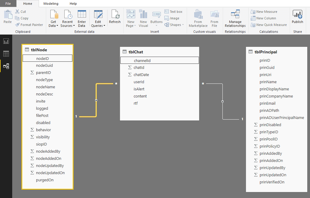
Going back to Persistent Chat for Skype For Business, chat room and user data is persisted in a SQL Server database. Let’s look at some important tables for Lync Group Chat 2010, one of the predecessors of Skype For Business Persistent Chat, which has a very similar structure to Skype For Business 2015 Persistent Chat.
- tblChat - contains all the messages sent in chatrooms.
- tblNode - contains all the chatrooms and their respective categories that the chatrooms might be associated with.
- tblPrincipal - contains the information about all the users that are enabled for Persistent Chat and the AD groups that they potentially are associated with.
- few more dozens of tables but they are out of scope for our exercise.
Shall we start doing our little proof of concept?
Preparing the DataSet and Relationships
Let’s start by opening the PowerBi Desktop application, which you can easilly download for free from the Microsoft website. First thing to do is to authenticate against it with an Office365 account.
After authenticating the user is guided to the start page which has a form to create a new project.
As expected the user is prompted with a menu that allows it to choose where to get its data from. In this case we want to get the data from the Persistent Chat database in our Skype For Business 2015 dev environment. After selecting SQL Server database option the application ask the user to fill in the server details and the database name. In addition it is required to specify which Data Connectivity mode we prefer:
-
Import - extracts the data from your database and pulls it into the Power BI Desktop :
- Gives you the full suite of transformation and data manipulation in the Desktop.
- Consumes and pushes the data into the Power BI Azure backend
- Can only be refreshed up to 8x a day by setting up a scheduled refresh (In the Service)
-
Direct Query - leaves the data in the database and sends queries to pull the information:
- Limits your ability to manipulate data in the Desktop (removes the Data section).
- Leaves the data in the SQL database.
- Is live, no need to schedule a refresh.
In this example we suggest to select the Import option as we want to be able to do transformation and data manipulation.
Ok so now it’s time to specify the credentials to access the database and then press Connect.
Now that we have tested that we can connect to the Persistent Chat database we are prompted with a navigator that allows the user to select which tables they want to import. We will select the three tables that were mentioned in the previous section: tblNode, tblPrincipal and tblChat. Since tblChat has thousands and thousands of rows it will take a while to load all the rows.
Great! Once all the tables are loaded we will be taken to the project’s main page and on the left hand side there will be 3 icons:
- Reports icon - where we place the actual charts and buttons for our report.
- Data icon - where the data is defined - queries, lookups and so on.
- Relationships icon - where the relationships between our entities are outlined.
Before doing anything else, maybe now it’s a good time to save your project.
If you click on the Data icon you’ll be able to see imported tables and their respective data.
But first we need to define the relationships between the tables! So click on the Relationships icon.
We can see the three tables that we’ve loaded from our database connection. The goal is to clearly specify that:
-
tblChat’s userId tells us which user sent the respective message so the userId in tblChat will correspond to the prinId in tblPrincipal. In order to establish that relationship just drag the prinId field in tblPrincipal to userId field in tblChat. Now for a given userId in tblChat we will be able to know more about that user - more specifically - the prinName which corresponds to the user name that will be displayed in the chart.
-
tblChat’s channelId is referring to what group was the message sent in so in order to get the information about that group we need to drag the tblNode’s nodeId to tblChat’s channelId field.
It should look like this:
Creating the report
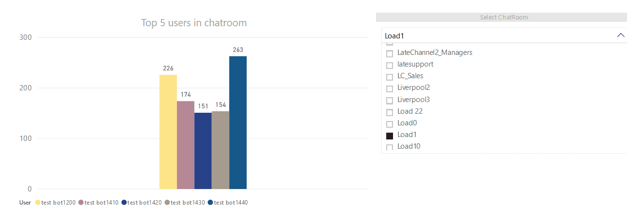
Now that the data is there we can start creating the report which will include a chart and a dropdown to select the chatroom that we wish to see the top 5 users that have sent more messages. First thing to do is to rename the the page for that report from Page 1 to Top 5 Users in Chatroom.
Adding the slicer
By pressing the Reports icon we are taken to the area where we can drop the slicer that will contain all the chatrooms in our Persistent Chat environment. The slicer can be formatted to look like a dropdown.
The Visualizations navigator has a list of predefined objects so we need to press the slicer icon.
There are several properties that need to be filled so that the slicer displays all the chatrooms in a dropdown.
First the filters:
- Field: Drag the nodeName field from the tblNode table.
-
Filters:
-
Page level filters: This affects which rows will be shown in the dropdown.
- drag the disabled field from tblNode here and tick the False box as we only want to show chatrooms that are enabled.
- drag the nodeType field from tblNode here and tick the False box as we only want to filter out chatroom categories from the eligible chatrooms.
-
And then the Formatting:
- First, click on the paint roller icon!
-
Here you can define the visual aspects of the slicer.
- You can edit the title by switching the Title on.
- Or edit edit the Header.
- and change other properties as you please :)
To behave like a dropdown instead of a list hover the slicer’s header and there is the possibility to choose between list or dropdown.
Now you should be able to see the dropdown with all the valid chatrooms!
Adding the Clustered Column chart and linking it with the dropdown
It’s time to add the chart that will show us the top 5 users for a chatroom!
The Clustered column chart will do just fine so in order to add it to our report simply press the report page and then click on the corresponding icon and place it next to the dropdown.
Ok so now it is time to configure the chart!
Our first goal is to link the chart with the dropdown so that every time we choose a different chatroom the chart component displays the top 5 users for the selected chatroom.
In order to achieve this we need to :
-
Highlight the slicer component.
-
Select the Format tab (in between Help and Data/Drill tabs).
-
Switch on Edit Interactions.
-
Filter controls are represented by the funnel icon on top of each component.
- Initially all the Filter icons are selected.
-
Highlight both components and ensure the filter controls are selected for both.
-
Now we need to configure the chart accordingly:
-
Highlight the chart component and check the fields section on the right hand side.
-
Filters :
-
Legend:
- This will determine what will be shown in the X axis. Since we want to display a bar for each of the top 5 users in the chatroom this has to show the user name. Don’t forget that we have established the relationship between tblPrincipal and tblChat. So for each tblChat row there is a userId associated with a message sent and that is linked with the respective user in tblPrincipal. To show the sender’s user name we simply need to drag the prinName from tblPrincipal to the Legend data field. We can rename the what is shown in the chart by clicking the arrow next to prinName and by clicking on Rename.
-
Value:
- This will reflect what should be displayed in the Y axis. In our case we want a count of each occurences of a given channelId in the tblChat. This will give us a count of all messages in that chatroom. In order to achieve this we just need to drag the channelId field in tblChat and drop it in the Value data field. Once that is done if you click the arrow next to it some options will appear and the one that we want is Count.
-
At the moment you should be able to change the chatroom and see a new graph being drawn every time you select a new chatroom. It is showing the number of messages sent by each user in the given chatroom. Now we want to limit it to only show 5 users and improve the looks of that chart!
-
Visual level filters:
-
User (all)
- Click on Filter type and select Top N.
- Next to Top type 5.
- Now drag chatId from tblChat to By value section.
- Click on Apply filter and it should only display the top 5 users in that chatroom!
-
-
-
Format :
-
Here it is where you can change the layout of the chart. For instance you can move the legend to be at the bottom instead of being at the top or you can add a title to any of the axis.
-
More visual aspects can be changed such as the colour of the bars or add some nice labels that indicate the absolute number of messages sent to them.
-
Publish the report!
Now that we have done what we wanted we need to publish the report that we have just done to the cloud!
In order to achieve that go to File and click on the Publish button!
After the success dialog click on the link provided and you will be redirected to the PowerBi portal so sign in using the same credentials as before and you should be able to see this report in your workspace.
If you want to publish it to the Internet or to embed in a SharePoint or to a Powerpoint simply go to File and those options will be available!
Conclusions
This was a very basic example on how we can combine a powerful visual tool like the Power BI with the Skype For Business Persistent Chat database to show us interesting information about a chatroom usage.
Another good example that I was also working on was to create a word cloud chart that is built of the most used words in a chatroom but unfortunately that is still work in progress as it requires a bit more advanced algorithms to gather the meaningful words present in messages that are sent in a chatroom.
My experience with Power Bi was very positive as I found the tool quite powerful and easy to integrate with existing systems. It allows the user to get data from a long list of data sources and it offers a wide range of different charts that display the information the users need. With the R Script Editor,which I did not cover on this example, the more technical user will feel more empowered to use their scripting abilities to create and use their own Power Bi visuals.
As a quick and last note I am definitely not an expert on Power Bi so if you found something that was wrong or could be explained better please leave a friendly comment :)
Hopefully this article has sparked some curiosity about this tool!

Written by Gonçalo Ferreira.
I believe in Ripple XRP and so should you.